Graphs
Graphs can be added to a report within widgets to display any data that provides valuable insights.
The following Graph types are supported:
- One-dimensional: Treemap, Pie, Gauge
- Two-dimensional: Column, Bar, Line, Spiderweb, Street Map
- Three-dimensional: Bubble Chart
Column
Section titled “Column”Column graphs displays the values split on the x-axis, with the value in the y-axis. It is possible to stack (putting different groups together) or aggregate (aggregates from the previous split element). Column graphs displays data with vertical columns proportional to values.
- Example shows stacked grouping over time periods on X-axis.
- Vertical columns represent values for each grouped series.
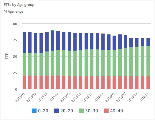
$olap.addGraph("2", "FTEs by Age group", "[time_month]:[age_range]", "","0");$olap.addGraphAxis('2', '1', 'FTE','false')$olap.addGraphData("2", "2","1", "'FTEs':[age_range]", "Sum([fraction]/100))", "column","stacked", "", "");The grouping of data is based on “Age Groups”, and then stacked. The split is on the months, giving us a chart that shows the development for the age groups over time.
Combined
Section titled “Combined”It is possible to combine different types in the same chart, and to use dual y-axis.
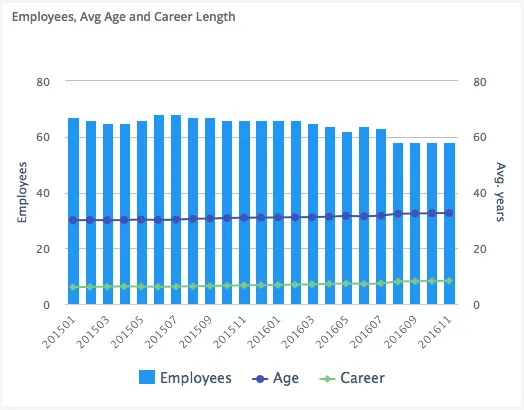
$olap.addGraph("1", "Employees, Avg Age and Career Length", "[time_month]:[key_company]", "","0");$olap.addGraphAxis('1', '1', 'Employees','false')$olap.addGraphAxis('1', '2', 'Avg. years','true','0','80','10')$olap.addGraphData("1", "1","Employees", "[key_company]", "count(distinct [employee_number])", "column","", "", "");$olap.addGraphData("1", "2","Age", "[key_company]", "avg([age])", "spline","", "", "")$olap.addGraphData("1", "2","Career", "[key_company]", "avg([career_length])", "spline","", "", "");The second axis is added using the “opposite” parameter set to “true”, also including the min/max/interval parameter. This ensures that the scale does not change when filtering the content. The first axis will change based on the values.
The first axis is using columns to display the values, the second axis is displayed using a line.
Bubble
Section titled “Bubble”A bubble chart differs from columns and line charts by also having a “Z” dimension, which is the bubble size.
To set up the graph axis, the “opposite” graph axis will be the x-axis.
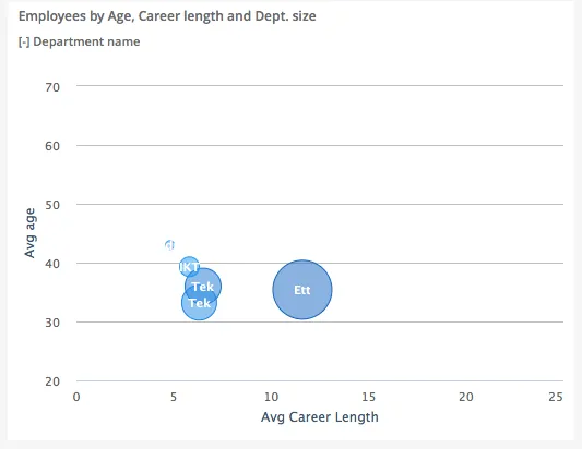
$olap.addGraph("5", "Employees by Age, Career length and Dept. size", "[key_company]:[department_name]", "","0");$olap.addGraphAxis('5', '1', 'Avg age','false','20','70','10')$olap.addGraphAxis('5', '1', 'Avg Career Length','true','0','25','5')$olap.addGraphBubbleData("5", "1","-", "[department_name]", "round(avg([career_length]),1)", "round(avg([age]),1)", "count(distinct [employee_number])", "", "","")Note the second line to set up the X-axis, and how to set the minimum, maximum and interval.
The actual data series takes 3 values, first is x-axis, second is y-axis, and third is bubble size (z dimension).
TreeMap
Section titled “TreeMap”A treemap is a graph that utilize the entire graph area, and visualize each split using a % size of the total area. (50% of the total sum will fill 50% of the area).
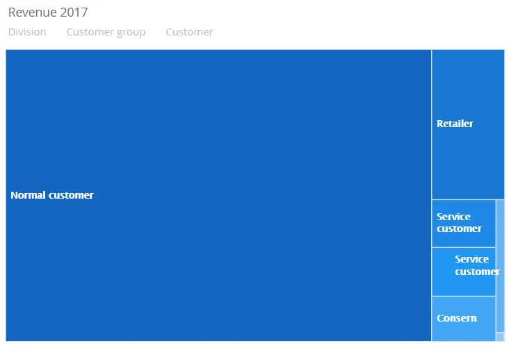
$olap.addGraph("2","Revenue ?period.getYear()","[division]:[customer_group]:[customer_number]","[invoice_year]=?period.getYear()","0")$olap.addGraphAxis("2","1","Amount","")$olap.addGraphData("2","1","Revenue","[division]:[customer_group]:[customer_number]","sum([invoiced_amount_dcur])","treemap","","","","M")The script creates a Treemap graph that filters one level, the customer_group. The size of the area is based on the sum of invoiced_amount_dcur.
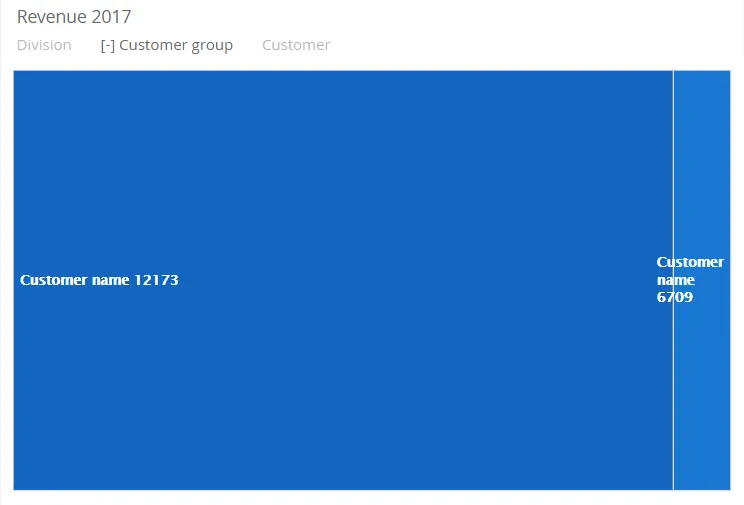
$olap.addGraph("2","Revenue ?period.getYear()","[division]:[customer_group]:[customer_number]","[invoice_year]=?period.getYear()","0");$olap.addGraphAxis("2","1","Amount","");$olap.addGraphData("2","1","Revenue","[division]:[customer_group]:[customer_number]","sum([invoiced_amount_dcur])","treemap","","","","M");In this example it is possible to filter in several dimensions:
[division]:[customer_group]:[customer_number]
When the user selects a Customer group, the TreeMap will display the related Customer number’s.
A pie is a graph that utilize the entire graph area in a circle, and visualize each split using a % size of the total area. (50% of the total sum will fill 50% of the area).
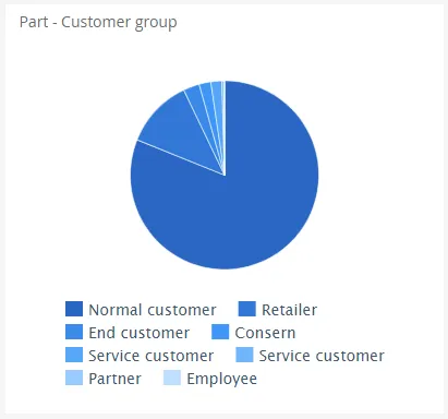
$olap.addGraph('3','Part - Customer group','[Company]:[customer_group]',"")$olap.addGraphAxis("3","1","Amount","")$olap.addGraphData('3','1','1','[customer_group]:[customer]','sum([invoiced_amount_dcur])','pie',"","","")$olap.setGraphSize("3","XS12","SM3","MD3","LG3")The script creates a Pie that filters one level, the customer_group. The size of the area is based on the sum of invoiced_amount_dcur.
Spline
Section titled “Spline”A spline is a graph that displays a set of data points connected by a curved line.
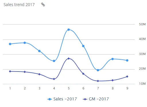
$olap.addGraph("1","Sales trend ?period.getYear()","[invoice_month_no]","[invoice_year]=?period.getYear()","0")$olap.addGraphAxis("1","N","NOK","true")$olap.addGraphData("1","N","Sales -","[invoice_year]","sum([invoiced_amount_dcur])","spline","","","","")$olap.addGraphData("1","N","GM -","[invoice_year]","sum([invoiced_amount_dcur]-[issued_cost_amount_dcur])","spline","","","")$olap.setGraphUrlLink("1","33:54")$olap.setGraphDataSkipZeros("1", "Sales -", "3")A bar is a graph that displays data with horizontal bars proportional to values.
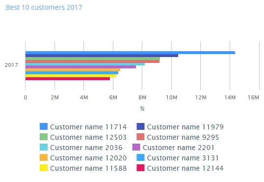
$olap.addGraph("5","Best 10 customers ?period.getYear()","[invoice_year]","[invoice_year]=?period.getYear()","0");$olap.addGraphAxis("5","1","%","");$olap.addGraphData("5","1","","[customer_name]","sum([invoiced_amount_dcur])","bar","","","10","M");$olap.setGraphSize('5','XS12','SM4','MD4','LG4')Spiderweb
Section titled “Spiderweb”A spiderweb is a graph where there are no x-axis, and the y-axis will start in the middle of the graph (value=0) and move outwards proportional to the value. Spiderweb can be combined with other graph types, such as column in the example below.
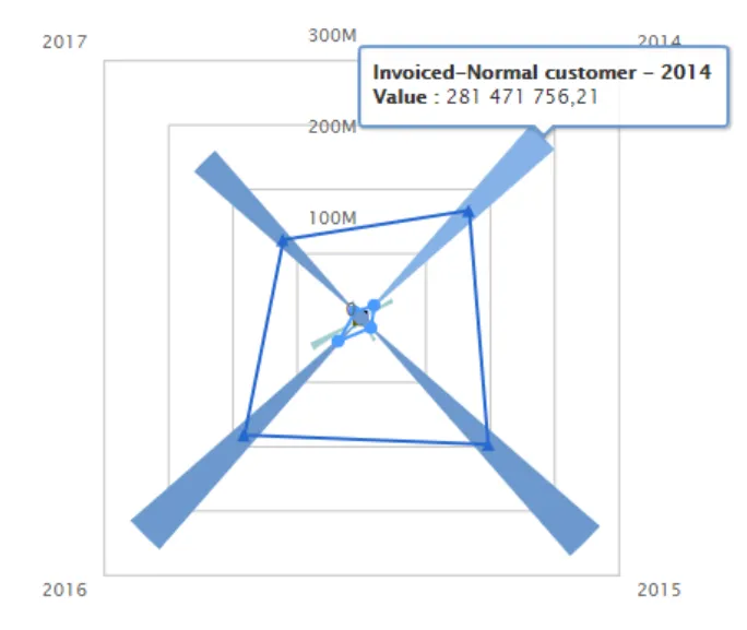
$olap.addGraph("2","Sales - customer-group","[invoice_year]","[invoice_year]>=2014","2");$olap.addGraphData("2","1","Invoiced-","[customer_group_description]","sum([invoiced_amount_dcur])","column","","","");$olap.addGraphData("2","2","COGS-","[customer_group_description]","sum([issued_cost_amount_dcur])","spiderweb","","","");$olap.setGraphColors("2", "#0066cc:#9999cc#669933:#3399FF")$olap.setGraphSize("2","XS12","SM3","MD3","LG4")$olap.setGraphDataSkipZeros("2", "3", "3")$olap.hideGraphLegend('2')A gauge graph (or speedometer chart) is an effective way of illustrating performance result. The graph is easy to understand and will give you an instant indication of the performance in the area you look at.
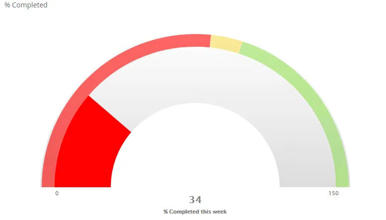
$olap.addGraph("4", "% Completed", "[company_name]", "[week]=$period.getCP()","0")$olap.addGraphAxis('4', '1', '% Completed this week','false','0','150','150')$olap.addGraphPlotBands('4', '1', '50','#ff0000','0','.533'); ##$olap.addGraphPlotBands('4', '1', '150','#F9DD51','.5333','.6');$olap.addGraphPlotBands('4', '1', '2000','#98DF58','.6','1.2');$olap.addGraphDataWithTarget("4", "1","1", "[company_name]", "round(sum(case when [postatus_no] in (300) then [hours_to_plan] else 0.0001 end)/(sum([used_capacity_hrs]+[capasity_hrs])),2)*100","(100)", "gauge","", "", "","")Street map
Section titled “Street map”A street map graph can show data related to a geographical location. Data values are displayed as markers on the map. You are able to zoom in and out and you can also filter your data as in any report in Deem Insight.
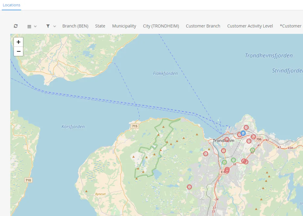
$olap.addGraph('1','Customer locations','[company_name]','','0')$olap.addGraphAxis('1','1','Amount','')$olap.addGraphStreetMapUtmData("1", "1","1", "[running_number_ts]", "'33'", "'W'", "[customer_utm33_east]", "[customer_utm33_west]", "sum(7)", "[customer_activity_level]=0", "")$olap.addGraphStreetMapUtmData("1", "1","2", "[running_number_ts]", "'33'", "'W'", "[customer_utm33_east]", "[customer_utm33_west]", "sum(7)", "[customer_activity_level]=1", "")$olap.addGraphStreetMapUtmData("1", "1","3", "[running_number_ts]", "'33'", "'W'", "[customer_utm33_east]", "[customer_utm33_west]", "sum(7)", "[customer_activity_level]=2", "")$olap.setGraphColors("1", "red:blue:green")Graph Method Overview
Section titled “Graph Method Overview”addGraph
Section titled “addGraph”The addGraph method is mandatory for creating a new graph, as it initializes the widget in the associated report. “graph_id”, “axis_id”, “axis_label”, “opposite”, “min”, “max”, “interval” )
##### Parameter Variable DescriptionNormal parameter variables:* graph_id: The unique identifier of the graph to update.* axis_id: A user-defined unique identifier for this axis. The axis_id specified here must be passed as an argument to subsequent methods to further configure and customize the axis of the graph.* opposite: Defines which side of the graph the axis appears on.  * Valid arguments: false (default) = left side, true = right side.
Optional arguments:* min: Minimum value of the axis. Set to NULL to calculate automatically.* max: Maximum value of the axis. Set to NULL to calculate automatically.* interval: Step size between values on the axis. Set to NULL to calculate automatically.
Example with given arguments:```js$olap.addGraphAxis(    "sales_trend",    "gross_margin_ratio",    "% of gross margin",    "True",    "NULL",    "NULL",    "NULL"    )
addGraphData
Section titled “addGraphData”Adds data to the graph. Multiple data series can be added to the same graph using this function.
Syntax with parameter variables:
$olap.addGraphData( "graph_id", "axis_id", "dataseries_label", "series", "measure", "chart_type", "aggregation", "filter", "limit", "orderby" )Parameter Variable Description
Section titled “Parameter Variable Description”Normal parameter variables:
- graph_id: The unique identifier of the graph to update.
- axis_id: The unique identifier for this axis to update. dataseries_label: The label for the data series shown in the graph legend and tooltip. Use a dash (”-”) to inherit the value from the series column, or combine it with text (e.g., “Revenue: -”).
- series: The column used to create multiple visual series (e.g., color-coded groups) within each X-axis category. Rows with different values in this column appear as different colored segments in the graph (e.g., stacked bars per product group per month).
- measure: The expression to calculate for each series.
- chart_type: The chart type used for the series.
- Valid arguments: column, bar, line, spline, trendline, areaspline, pie, bubble, treemap, spiderweb.
- aggregation: Defines how the data is grouped. Set to NULL if not required.
- Valid arguments: stacked, aggregated.
- filter: Optional filter expression for this series. Will be combined with any filters in the addGraph method. Set to NULL if not required.
Optional arguments:
- limit: Limits the number of series shown.
- order_by: Defines the sorting method for the series. Set to NULL if not required.
- Valid arguments: M, …
Example with given arguments:
$olap.addGraphData( "sales_trend", "gross_margin_ratio", "-", "[product_group_description]", "sum([gross_margin_amount])/ sum([invoiced_amount])", "column", "stacked", "NULL", "NULL", "NULL" )hideGraphLegend
Section titled “hideGraphLegend”Hides the legend of the graph data (the Series values). Useful when there is a lot of different values in the Series. Using mouseover will show the series description.
Syntax with parameter variables:
$olap.hideGraphLegend( "graph_id" )Parameter Variable Description
Section titled “Parameter Variable Description”- graph_id: The unique identifier of the graph to update.
Example with given arguments:
$olap.hideGraphLegend( "sales_trend" )setGraphColors
Section titled “setGraphColors”Defines a custom color palette for the graph. This overrides the default project color scheme.
Syntax with parameter variables:
$olap.setGraphColors( "graph_id", "range" )Parameter Variable Description
Section titled “Parameter Variable Description”- graph_id: The unique identifier of the graph to update.
- color_range: A colon-separated list of HTML color codes or predefined color names. Colors are assigned in the order they are defined.
- Another example value: blue:red:green:purple.
Example with given arguments:
$olap.setGraphColors( "sales_trend", "#E91E63: #FCE4EC: #F8BBD0: #F48FB1: #F06292" )setGraphDataSkipZeros
Section titled “setGraphDataSkipZeros”Controls how zero values are displayed in a specific data series. This helps declutter the graph or highlight only meaningful values.
Syntax with parameter variables:
$olap.setGraphDataSkipZeros( "graph_id", "axis_id", "zero_mode" )Parameter Variable Description
Section titled “Parameter Variable Description”- graph_id: The unique identifier of the graph to update.
- axis_id: The unique identifier for this axis to update.
- zero_mode: Defines how zero and NULL values are treated in the graph.
- Valid arguments: 1 (default) = Show all values (including zeros), 2 = Hide zero values (but keep NULLs), 3 = Hide both zero and NULL values.
Example with given arguments:
$olap.setGraphDataSkipZeros( "sales_trend", "gross_margin_ratio", "3" )setGraphSize
Section titled “setGraphSize”Defines the width of the graph widget for different screen sizes, using bootstrap grid classes. This enables responsive layouts so tables look good on mobile, tablet, and desktop devices.
Syntax with parameter variables:
$olap.setGraphSize( "graph_id", "xs_size", "sm_size", "md_size", "lg_size" )Parameter Variable Description
Section titled “Parameter Variable Description”- graph_id: The unique identifier of the graph to update.
- xs_size: Width of the KPI on extra small screens (mobile).
- Valid arguments: XS1, XS2, …, XS12
- sm_size: Width of the KPI on small screens (tablets).
- Valid arguments: SM1, SM2, …, SM12
- md_size: Width of the KPI on medium screens (desktops).
- Valid arguments: MD1, MD2, …, MD12
- lg_size: Width of the KPI on large screens (large desktops).
- Valid arguments: LG1, LG2, …, LG12
Example with given arguments:
$olap.setGraphSize( "sales_trend", "XS12", "SM6", "MD6", "LG6" )setGraphSource
Section titled “setGraphSource”Overrides the default data source for a graph, allowing it to retrieve data from an alternative table or view. This is useful when graph data is stored in a different dataset than the report’s main data source. Using filter and drill functionality works if the dimensions are equally named (same column names).
Syntax with parameter variables:
$olap.setGraphSource( "graph_id", "alias_key", "matrix_name" )Parameter Variable Description
Section titled “Parameter Variable Description”Normal parameter variables:
- graph_id: The unique identifier of the graph to update.
- matrix_name: The name of the alternative data source table or view.
Optional argument:
- alias_key: The connection key for an external database if the data source is in a different database.
Example with given arguments:
$olap.setGraphSource( "sales_trend", "mssql", "fact_sales_ledger" )setMainGraphHeight
Section titled “setMainGraphHeight”Overrides the default height of all graphs in the report.
Syntax with parameter variables:
$olap.setMainGraphHeight( height )Parameter Variable Description
Section titled “Parameter Variable Description”- height: The height of the graph area, in percentage of the default height.
Example: Setting to 50 makes graphs half as tall, allowing for two rows of graphs on a single screen
$olap.setMainGraphHeight( 50 )setGraphXAxisType
Section titled “setGraphXAxisType”Defines the type and formatting of the X-axis.
Syntax with parameter variables:
$olap.setGraphXAxisType( "graph_id", "xaxis_type", "xaxis_label", "min", "max", "interval" )Parameter Variable Description
Section titled “Parameter Variable Description”Normal parameter variables:
- graph_id: The unique identifier of the graph to update.
- xaxis_type: Defines the X-axis type.
- Valid arguments: Category, …
Optional arguments:
- xaxis_label: Title of the X-axis.
- min: Minimum value of the axis. Set to NULL to calculate automatically.
- max: Maximum value of the axis. Set to NULL to calculate automatically.
- interval: Step size between values on the axis. Set to NULL to calculate automatically.
Example with given arguments:
$olap.setGraphXAxisType( "sales_trend", "Linear", "Month", "1", "12", "1" )setMainGraphWidth
Section titled “setMainGraphWidth”Overrides the default width of all graphs in the report.
Syntax with parameter variables:
$olap.setMainGraphWidth( width )Parameter Variable Description
Section titled “Parameter Variable Description”- width: The width of the graph area, in percentage of the default width.
Example: Setting to 50 makes graphs half as wide, allowing for two columns of graphs on a single screen
$olap.setMainGraphWidth( 50 )setGraphUrlLink
Section titled “setGraphUrlLink”Adds a clickable link to the graph widget that navigates to a report or another internal URL when the link is clicked.
Syntax with parameter variables:
$olap.setGraphUrlLink( "graph_id", "internal_url" )Parameter Variable Description
Section titled “Parameter Variable Description”- graph_id: The unique identifier of the graph to update.
- internal_url: The clickable link. Part of or the full internal URL (e.g., report reference). The full internal URL in the example: http://localhost:18080/demo/ui#!x35_109.
Example with given arguments:
$olap.setGraphUrlLink( "sales_trend", "x35_109" )setGraphLinkScript
Section titled “setGraphLinkScript”Syntax with parameter variables:
$olap.setGraphLinkScript( "graph_id", "key_column", "position", "url", "url_label", "menu" )Parameter Variable Description
Section titled “Parameter Variable Description”There are various of ways to link from a graph to another report. Contact your consultant for more information.
- GraphId: The graph to set the link.
- Key: The field to filter on.
- Pos: The axis id.
- Url: The last part of the url to the report you want to link.
- Label: The link description.
- Menu: 0 = don’t show label, 1 = show label.
Example with given arguments:
$olap.setGraphLinkScript( "sales_trend", "key_column", "position", "internal_url", "url_label", "menu" )$olap.setGraphLinkScript("1","[owner_key]",1,"node=53:18;filter=[owner_key]='{0}'","-> Open opportunities report",1)$olap.setGraphLinkScript("1","[owner_key]",2,"report=closedopportunity;filter=[owner_key]='{0}'","-> Closed opportunities report",1)$olap.setGraphLinkScript("1","[owner_key]",3,"https://www.google.no/q={0}","-> Google search",1)$olap.setGraphLinkScript('1','[account_key]',1,'document=Account;key={0};tab=opportunity','-> Account','menu(0/1)')$olap.setGraphLinkScript("1","[cost_center_group_2]",1,"node=35:53;filter=[cost_center_group_2]='{0}'","-> Open detailed report",0)setGraphDataMarker
Section titled “setGraphDataMarker”Syntax with parameter variables:
$olap.setGraphDataMarker("GraphId", "Id", "Marker")Example with given arguments:
$olap.setGraphDataMarker("1", "id", "0")addGraphPlotBands
Section titled “addGraphPlotBands”Syntax with parameter variables:
$olap.addGraphPlotBands('GraphId', 'Id', 'Title','Color','FromValue','ToValue')Parameter Variable Description
Section titled “Parameter Variable Description”Use this function when you want to set the intervals of the colors in a gauge graph.
- GraphId: The graph id.
- Id: The axis id.
- Title:
- Color: The color in the range
- FromValue: Range from
- ToValue: Range to
Example with given arguments:
$olap.addGraphPlotBands('4', '1', '50','#ff0000','0','.533')$olap.addGraphPlotBands('4', '1', '150','#F9DD51','.5333','.6')$olap.addGraphPlotBands('4', '1', '2000','#98DF58','.6','1.2')addGraphBubbleData
Section titled “addGraphBubbleData”Syntax with parameter variables:
$olap.addGraphBubbleData("GraphId", "AxisId","DataId", "Serie", "Measure", "Measure2", "Measure3", "Filter", "Limit","OrderBy")Parameter Variable Description
Section titled “Parameter Variable Description”Three-dimensional graph.
- GraphId: The graph id.
- AxisId: The axis id.
- DataId: Using a ”-” will use the value from serie. Any other value will be used as text. Can also be combined, “Product Group: - ”
- Serie: To split the measure, will be different colors for each split.
- Measure, measure2, measure3:
- Filter: Filter data in graph.
- Limit: Can be used to limit. Applies to the first measure? Input e.g. “10”
- Order by: Order by measure. Applies to the first measure? Input “M”
Example with given arguments:
$olap.addGraphBubbleData("5", "1","-", "[department_name]", "round(avg([career_length]),1)", "round(avg([age]),1)", "count(distinct [employee_number])", "", "","")addGraphStreetMapData
Section titled “addGraphStreetMapData”Syntax with parameter variables:
$olap.addGraphStreetMapData("GraphId", "AxisId","DataId", "Serie", "Latitude", "Longitude", "Measure", "Filter", "Limit")Parameter Variable Description
Section titled “Parameter Variable Description”Deem Insight supports different maps and types of geodata. Contact your consultant to discuss your possibilities.
Example with given arguments:
$olap.addGraphStreetMapData("graphId", "axisId","dataId", "serie", "latitude", "longitude", "measure", "filter", "limit")addGraphStreetMapUtmData
Section titled “addGraphStreetMapUtmData”Syntax with parameter variables:
$olap.addGraphStreetMapUtmData("graphId", "axisId","dataId", "serie", "zone", "letter", "east", "northing", "measure", "filter", "limit")Parameter Variable Description
Section titled “Parameter Variable Description”Deem Insight supports different maps and types of geodata. Contact your consultant to discuss your possibilities.
Example with given arguments:
$olap.addGraphStreetMapUtmData("1", "1","1", "[running_number_ts]", "'33'", "'W'", "[customer_utm33_east]", "[customer_utm33_west]", "sum(7)", "[customer_activity_level]=0", "")addGraphDataWithTarget
Section titled “addGraphDataWithTarget”Syntax with parameter variables:
$olap.addGraphDataWithTarget("graphId", "axisId","dataId", "serie", "measure","target", "chartType","stacked", "filter", "limit","orderBy")Parameter Variable Description
Section titled “Parameter Variable Description”This part of the user guide is under construction.
addGraph
Section titled “addGraph”The addGraph method is mandatory for creating a new graph, as it initializes the widget in the associated report.
Syntax with parameter variables:
$olap.addGraph( "graph_id", "title_label", "split_element", "data_filter", "olap_scope" )Parameter Variable Description
Section titled “Parameter Variable Description”- graph_id: A user-defined unique identifier for this Graph. The graph_id specified here must be passed as an argument to subsequent methods (e.g., addGraphAxis, addGraphData) to further configure and customize the graph.
- title_label: The text label displayed as the title of this graph.
- split_element: The column used to split the graph along the X-axis. Rows with the same value are grouped together; rows with different values produce separate visual elements (e.g., one bar per month if using
[invoice_month]). - data_filter: General filter expression to limit which data is included for the graph. Set to NULL if not required.
- olap_scope: Defines which OLAP-actions affect the graph.
- Valid arguments: 0 = Respond to all actions, 1 = Respond only to header actions, 2 = Respond only to report-level actions.
Example with given arguments:
$olap.addGraph( "sales_trend", "Sales Trend", "[invoice_month]", "[invoiced] = 1", "0")addGraphAxis
Section titled “addGraphAxis”Adds a Y-axis to the graph. You can add multiple Y-axes (e.g., left and right) to visualize measures with different units or scales, such as amounts and percentages.
Syntax with parameter variables:
$olap.addGraphAxis( "graph_id", "axis_id", "axis_label", "opposite", "min", "max", "interval" )Parameter Variable Description
Section titled “Parameter Variable Description”Normal parameter variables:
- graph_id: The unique identifier of the graph to update.
- axis_id: A user-defined unique identifier for this axis. The axis_id specified here must be passed as an argument to subsequent methods to further configure and customize the axis of the graph.
- opposite: Defines which side of the graph the axis appears on.
- Valid arguments: false (default) = left side, true = right side.
Optional arguments:
- min: Minimum value of the axis. Set to NULL to calculate automatically.
- max: Maximum value of the axis. Set to NULL to calculate automatically.
- interval: Step size between values on the axis. Set to NULL to calculate automatically.
Example with given arguments:
$olap.addGraphAxis( "sales_trend", "gross_margin_ratio", "% of gross margin", "True", "NULL", "NULL", "NULL" )addGraphData
Section titled “addGraphData”Adds data to the graph. Multiple data series can be added to the same graph using this function.
Syntax with parameter variables:
$olap.addGraphData( "graph_id", "axis_id", "dataseries_label", "series", "measure", "chart_type", "aggregation", "filter", "limit", "orderby" )Parameter Variable Description
Section titled “Parameter Variable Description”Normal parameter variables:
- graph_id: The unique identifier of the graph to update.
- axis_id: The unique identifier for this axis to update. dataseries_label: The label for the data series shown in the graph legend and tooltip. Use a dash (”-”) to inherit the value from the series column, or combine it with text (e.g., “Revenue: -”).
- series: The column used to create multiple visual series (e.g., color-coded groups) within each X-axis category. Rows with different values in this column appear as different colored segments in the graph (e.g., stacked bars per product group per month).
- measure: The expression to calculate for each series.
- chart_type: The chart type used for the series.
- Valid arguments: column, bar, line, spline, trendline, areaspline, pie, bubble, treemap, spiderweb.
- aggregation: Defines how the data is grouped. Set to NULL if not required.
- Valid arguments: stacked, aggregated.
- filter: Optional filter expression for this series. Will be combined with any filters in the addGraph method. Set to NULL if not required.
Optional arguments:
- limit: Limits the number of series shown.
- order_by: Defines the sorting method for the series. Set to NULL if not required.
- Valid arguments: M, …
Example with given arguments:
$olap.addGraphData( "sales_trend", "gross_margin_ratio", "-", "[product_group_description]", "sum([gross_margin_amount])/ sum([invoiced_amount])", "column", "stacked", "NULL", "NULL", "NULL" )hideGraphLegend
Section titled “hideGraphLegend”Hides the legend of the graph data (the Series values). Useful when there is a lot of different values in the Series. Using mouseover will show the series description.
Syntax with parameter variables:
$olap.hideGraphLegend( "graph_id" )Parameter Variable Description
Section titled “Parameter Variable Description”- graph_id: The unique identifier of the graph to update.
Example with given arguments:
$olap.hideGraphLegend( "sales_trend" )setGraphColors
Section titled “setGraphColors”Defines a custom color palette for the graph. This overrides the default project color scheme.
Syntax with parameter variables:
$olap.setGraphColors( "graph_id", "range" )Parameter Variable Description
Section titled “Parameter Variable Description”- graph_id: The unique identifier of the graph to update.
- color_range: A colon-separated list of HTML color codes or predefined color names. Colors are assigned in the order they are defined.
- Another example value: blue:red:green:purple.
Example with given arguments:
$olap.setGraphColors( "sales_trend", "#E91E63: #FCE4EC: #F8BBD0: #F48FB1: #F06292" )setGraphDataSkipZeros
Section titled “setGraphDataSkipZeros”Controls how zero values are displayed in a specific data series. This helps declutter the graph or highlight only meaningful values.
Syntax with parameter variables:
$olap.setGraphDataSkipZeros( "graph_id", "axis_id", "zero_mode" )Parameter Variable Description
Section titled “Parameter Variable Description”- graph_id: The unique identifier of the graph to update.
- axis_id: The unique identifier for this axis to update.
- zero_mode: Defines how zero and NULL values are treated in the graph.
- Valid arguments: 1 (default) = Show all values (including zeros), 2 = Hide zero values (but keep NULLs), 3 = Hide both zero and NULL values.
Example with given arguments:
$olap.setGraphDataSkipZeros( "sales_trend", "gross_margin_ratio", "3" )setGraphSize
Section titled “setGraphSize”Defines the width of the graph widget for different screen sizes, using bootstrap grid classes. This enables responsive layouts so tables look good on mobile, tablet, and desktop devices.
Syntax with parameter variables:
$olap.setGraphSize( "graph_id", "xs_size", "sm_size", "md_size", "lg_size" )Parameter Variable Description
Section titled “Parameter Variable Description”- graph_id: The unique identifier of the graph to update.
- xs_size: Width of the KPI on extra small screens (mobile).
- Valid arguments: XS1, XS2, …, XS12
- sm_size: Width of the KPI on small screens (tablets).
- Valid arguments: SM1, SM2, …, SM12
- md_size: Width of the KPI on medium screens (desktops).
- Valid arguments: MD1, MD2, …, MD12
- lg_size: Width of the KPI on large screens (large desktops).
- Valid arguments: LG1, LG2, …, LG12
Example with given arguments:
$olap.setGraphSize( "sales_trend", "XS12", "SM6", "MD6", "LG6" )setGraphSource
Section titled “setGraphSource”Overrides the default data source for a graph, allowing it to retrieve data from an alternative table or view. This is useful when graph data is stored in a different dataset than the report’s main data source. Using filter and drill functionality works if the dimensions are equally named (same column names).
Syntax with parameter variables:
$olap.setGraphSource( "graph_id", "alias_key", "matrix_name" )Parameter Variable Description
Section titled “Parameter Variable Description”Normal parameter variables:
- graph_id: The unique identifier of the graph to update.
- matrix_name: The name of the alternative data source table or view.
Optional argument:
- alias_key: The connection key for an external database if the data source is in a different database.
Example with given arguments:
$olap.setGraphSource( "sales_trend", "mssql", "fact_sales_ledger" )setMainGraphHeight
Section titled “setMainGraphHeight”Overrides the default height of all graphs in the report.
Syntax with parameter variables:
$olap.setMainGraphHeight( height )Parameter Variable Description
Section titled “Parameter Variable Description”- height: The height of the graph area, in percentage of the default height.
Example: Setting to 50 makes graphs half as tall, allowing for two rows of graphs on a single screen
$olap.setMainGraphHeight( 50 )setGraphXAxisType
Section titled “setGraphXAxisType”Defines the type and formatting of the X-axis.
Syntax with parameter variables:
$olap.setGraphXAxisType( "graph_id", "xaxis_type", "xaxis_label", "min", "max", "interval" )Parameter Variable Description
Section titled “Parameter Variable Description”Normal parameter variables:
- graph_id: The unique identifier of the graph to update.
- xaxis_type: Defines the X-axis type.
- Valid arguments: Category, …
Optional arguments:
- xaxis_label: Title of the X-axis.
- min: Minimum value of the axis. Set to NULL to calculate automatically.
- max: Maximum value of the axis. Set to NULL to calculate automatically.
- interval: Step size between values on the axis. Set to NULL to calculate automatically.
Example with given arguments:
$olap.setGraphXAxisType( "sales_trend", "Linear", "Month", "1", "12", "1" )setMainGraphWidth
Section titled “setMainGraphWidth”Overrides the default width of all graphs in the report.
Syntax with parameter variables:
$olap.setMainGraphWidth( width )Parameter Variable Description
Section titled “Parameter Variable Description”- width: The width of the graph area, in percentage of the default width.
Example: Setting to 50 makes graphs half as wide, allowing for two columns of graphs on a single screen
$olap.setMainGraphWidth( 50 )setGraphUrlLink
Section titled “setGraphUrlLink”Adds a clickable link to the graph widget that navigates to a report or another internal URL when the link is clicked.
Syntax with parameter variables:
$olap.setGraphUrlLink( "graph_id", "internal_url" )Parameter Variable Description
Section titled “Parameter Variable Description”- graph_id: The unique identifier of the graph to update.
- internal_url: The clickable link. Part of or the full internal URL (e.g., report reference). The full internal URL in the example: http://localhost:18080/demo/ui#!x35_109.
Example with given arguments:
$olap.setGraphUrlLink( "sales_trend", "x35_109" )setGraphLinkScript
Section titled “setGraphLinkScript”Syntax with parameter variables:
$olap.setGraphLinkScript( "graph_id", "key_column", "position", "url", "url_label", "menu" )Parameter Variable Description
Section titled “Parameter Variable Description”There are various of ways to link from a graph to another report. Contact your consultant for more information.
- GraphId: The graph to set the link.
- Key: The field to filter on.
- Pos: The axis id.
- Url: The last part of the url to the report you want to link.
- Label: The link description.
- Menu: 0 = don’t show label, 1 = show label.
Example with given arguments:
$olap.setGraphLinkScript( "sales_trend", "key_column", "position", "internal_url", "url_label", "menu" )$olap.setGraphLinkScript("1","[owner_key]",1,"node=53:18;filter=[owner_key]='{0}'","-> Open opportunities report",1)$olap.setGraphLinkScript("1","[owner_key]",2,"report=closedopportunity;filter=[owner_key]='{0}'","-> Closed opportunities report",1)$olap.setGraphLinkScript("1","[owner_key]",3,"https://www.google.no/q={0}","-> Google search",1)$olap.setGraphLinkScript('1','[account_key]',1,'document=Account;key={0};tab=opportunity','-> Account','menu(0/1)')$olap.setGraphLinkScript("1","[cost_center_group_2]",1,"node=35:53;filter=[cost_center_group_2]='{0}'","-> Open detailed report",0)setGraphDataMarker
Section titled “setGraphDataMarker”Syntax with parameter variables:
$olap.setGraphDataMarker("GraphId", "Id", "Marker")Example with given arguments:
$olap.setGraphDataMarker("1", "id", "0")addGraphPlotBands
Section titled “addGraphPlotBands”Syntax with parameter variables:
$olap.addGraphPlotBands('GraphId', 'Id', 'Title','Color','FromValue','ToValue')Parameter Variable Description
Section titled “Parameter Variable Description”Use this function when you want to set the intervals of the colors in a gauge graph.
- GraphId: The graph id.
- Id: The axis id.
- Title:
- Color: The color in the range
- FromValue: Range from
- ToValue: Range to
Example with given arguments:
$olap.addGraphPlotBands('4', '1', '50','#ff0000','0','.533')$olap.addGraphPlotBands('4', '1', '150','#F9DD51','.5333','.6')$olap.addGraphPlotBands('4', '1', '2000','#98DF58','.6','1.2')addGraphBubbleData
Section titled “addGraphBubbleData”Syntax with parameter variables:
$olap.addGraphBubbleData("GraphId", "AxisId","DataId", "Serie", "Measure", "Measure2", "Measure3", "Filter", "Limit","OrderBy")Parameter Variable Description
Section titled “Parameter Variable Description”Three-dimensional graph.
- GraphId: The graph id.
- AxisId: The axis id.
- DataId: Using a ”-” will use the value from serie. Any other value will be used as text. Can also be combined, “Product Group: - ”
- Serie: To split the measure, will be different colors for each split.
- Measure, measure2, measure3:
- Filter: Filter data in graph.
- Limit: Can be used to limit. Applies to the first measure? Input e.g. “10”
- Order by: Order by measure. Applies to the first measure? Input “M”
Example with given arguments:
$olap.addGraphBubbleData("5", "1","-", "[department_name]", "round(avg([career_length]),1)", "round(avg([age]),1)", "count(distinct [employee_number])", "", "","")addGraphStreetMapData
Section titled “addGraphStreetMapData”Syntax with parameter variables:
$olap.addGraphStreetMapData("GraphId", "AxisId","DataId", "Serie", "Latitude", "Longitude", "Measure", "Filter", "Limit")Parameter Variable Description
Section titled “Parameter Variable Description”Deem Insight supports different maps and types of geodata. Contact your consultant to discuss your possibilities.
Example with given arguments:
$olap.addGraphStreetMapData("graphId", "axisId","dataId", "serie", "latitude", "longitude", "measure", "filter", "limit")addGraphStreetMapUtmData
Section titled “addGraphStreetMapUtmData”Syntax with parameter variables:
$olap.addGraphStreetMapUtmData("graphId", "axisId","dataId", "serie", "zone", "letter", "east", "northing", "measure", "filter", "limit")Parameter Variable Description
Section titled “Parameter Variable Description”Deem Insight supports different maps and types of geodata. Contact your consultant to discuss your possibilities.
Example with given arguments:
$olap.addGraphStreetMapUtmData("1", "1","1", "[running_number_ts]", "'33'", "'W'", "[customer_utm33_east]", "[customer_utm33_west]", "sum(7)", "[customer_activity_level]=0", "")addGraphDataWithTarget
Section titled “addGraphDataWithTarget”Syntax with parameter variables:
$olap.addGraphDataWithTarget("graphId", "axisId","dataId", "serie", "measure","target", "chartType","stacked", "filter", "limit","orderBy")Parameter Variable Description
Section titled “Parameter Variable Description”This part of the user guide is under construction.
setColorByPoint
Section titled “setColorByPoint”Syntax with parameter variables:
$olap.setColorByPoint("graphId", "1")Parameter Variable Description
Section titled “Parameter Variable Description”This part of the user guide is under construction.
setShowGraphDataLabels
Section titled “setShowGraphDataLabels”Syntax with parameter variables:
$olap.setShowGraphDataLabels('graphId','id')Parameter Variable Description
Section titled “Parameter Variable Description”Shows the values in the graph.
- GraphId: The graph id.
- Id: The id of the axis, used when adding data to the graph.
Prerequisites
Section titled “Prerequisites”- Report with at least one configured graph script section.
- Valid dimensions and measures in report data source.
Applies to
Section titled “Applies to”- Product: Deem Insight
- Area: Report visualization
- Role: Administrator, consultant
Why is my graph empty even though table has data?
Section titled “Why is my graph empty even though table has data?”Verify graph filter/split expressions and null handling in both addGraph and addGraphData.
Which graph type is best for many categories?
Section titled “Which graph type is best for many categories?”Use bar/column with limits or grouping; avoid high-cardinality charts without reduction.