Spline
Overview
Section titled “Overview”- Type: Two-dimensional line chart with curved connections
- Dimensions: X-axis (categories/time), Y-axis (values)
- Use cases: Show trends over time, display smooth curves for data series, compare multiple trends, visualize time series data
- Special features: Curved lines (splines) create smoother visualizations than straight line segments
- Visual: Data points connected by smooth curved lines, making trends easy to follow
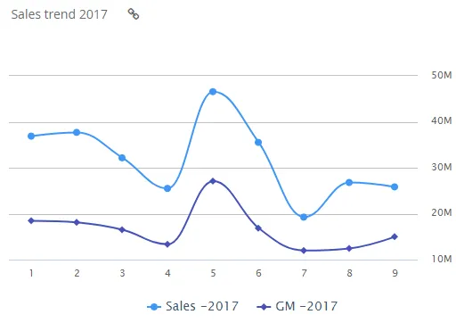
The image shows a spline chart displaying sales and gross margin trends over time, with smooth curved lines connecting data points for each series.
Quickstart
Section titled “Quickstart”To create a Spline chart, initialize the graph, add an axis, and use addGraphData with chart_type: "spline".
$olap.addGraph("1","Sales trend ?period.getYear()","[invoice_month_no]","[invoice_year]=?period.getYear()","0")$olap.addGraphAxis("1","N","NOK","true")$olap.addGraphData("1","N","Sales -","[invoice_year]","sum([invoiced_amount_dcur])","spline","","","","")$olap.addGraphData("1","N","GM -","[invoice_year]","sum([invoiced_amount_dcur]-[issued_cost_amount_dcur])","spline","","","")$olap.setGraphUrlLink("1","33:54")$olap.setGraphDataSkipZeros("1", "Sales -", "3")This produces a spline chart with smooth curved lines showing sales and gross margin trends over time, with clickable link to another report.
Axes setup
Section titled “Axes setup”Spline charts require at least one Y-axis. The X-axis comes from the split_element in addGraph.
Required axis setup:
$olap.addGraphAxis('graph_id', 'axis_id', 'Axis Label', 'opposite')Parameters:
graph_id: Your graph identifieraxis_id: Unique identifier for this axisAxis Label: Text displayed on the axisopposite:falsefor left side,truefor right side (dual axis)
Example - Single axis:
$olap.addGraphAxis("1","N","NOK","true")Example - Dual axis:
$olap.addGraphAxis('1', '1', 'Count','false')$olap.addGraphAxis('1', '2', 'Percentage','true','0','100','10')Data series
Section titled “Data series”Add data using addGraphData with chart_type: "spline". Multiple series create multiple lines.
Syntax:
$olap.addGraphData( "graph_id", "axis_id", "dataseries_label", "series", "measure", "spline", "", "filter", "limit", "orderby")Parameters:
| Parameter | Required | Description | Example |
|---|---|---|---|
graph_id | Yes | Unique graph identifier | "1" |
axis_id | Yes | The axis ID | "N" or "1" |
dataseries_label | Yes | Label in legend. Use "-" to inherit from series | "Sales -" |
series | Yes | Column for multiple lines | "[invoice_year]" or "[product]" |
measure | Yes | Value to display | "sum([amount])" |
chart_type | Yes | Must be "spline" | "spline" |
aggregation | No | Not used (use "") | "" |
filter | No | Additional filter | "[status] = 1" |
limit | No | Limit number of series | "5" |
orderby | No | Sort method | "M" |
Example - Single line:
$olap.addGraphData("1","N","Sales","[month]","sum([sales])","spline","","","","")Example - Multiple lines:
$olap.addGraphData("1","N","Sales -","[year]","sum([sales])","spline","","","","")$olap.addGraphData("1","N","GM -","[year]","sum([gross_margin])","spline","","","","")Example - Skip zeros:
$olap.setGraphDataSkipZeros("1", "Sales -", "3") // Hide zero and NULL valuesSize and layout
Section titled “Size and layout”Control responsive width using setGraphSize. Spline charts work well at medium to large sizes.
$olap.setGraphSize("graph_id", "XS12", "SM6", "MD6", "LG6")Recommended sizes:
- Medium:
"XS12", "SM6", "MD6", "LG6"(half width) - Large:
"XS12", "SM8", "MD8", "LG8"(two-thirds width) - Full:
"XS12", "SM12", "MD12", "LG12"(full width)
Common patterns
Section titled “Common patterns”Time series trend
Section titled “Time series trend”Show trend over time:
$olap.addGraph("1", "Sales Trend", "[month]", "","0");$olap.addGraphAxis("1","1","Amount","");$olap.addGraphData("1","1","Sales","[month]","sum([sales])","spline","","","","")Multiple series comparison
Section titled “Multiple series comparison”Compare multiple metrics:
$olap.addGraphData("1","1","Revenue","[month]","sum([revenue])","spline","","","","")$olap.addGraphData("1","1","Cost","[month]","sum([cost])","spline","","","","")$olap.addGraphData("1","1","Profit","[month]","sum([revenue]) - sum([cost])","spline","","","","")Year-over-year comparison
Section titled “Year-over-year comparison”Compare same period across years:
$olap.addGraph("1", "YoY Comparison", "[month_no]", "","0");$olap.addGraphData("1","1","2023","[year]", "sum([sales])","spline","[year] = 2023","","","")$olap.addGraphData("1","1","2024","[year]", "sum([sales])","spline","[year] = 2024","","","")Percentage trend
Section titled “Percentage trend”Show percentage change over time:
$olap.addGraphData("1","1","Growth %","[month]","((sum([sales]) - lag(sum([sales]))) / lag(sum([sales]))) * 100","spline","","","","")Skip zero values
Section titled “Skip zero values”Hide missing data points:
$olap.addGraphData("1","1","Sales","[month]","sum([sales])","spline","","","","")$olap.setGraphDataSkipZeros("1", "Sales", "3") // Hide zeros and NULLsTroubleshooting
Section titled “Troubleshooting”Line not showing
Section titled “Line not showing”- Check: Ensure
chart_typeis exactly"spline"(lowercase) - Check: Verify
split_elementinaddGraphhas valid values - Check: Confirm measure returns numeric values
- Check: If using
setGraphDataSkipZeros, zeros may be hidden
Line appears jagged
Section titled “Line appears jagged”- Issue: Curves not smooth
- Note: Splines should be smooth. If jagged, check data points - splines interpolate between points
- Fix: Ensure sufficient data points for smooth curves
Multiple lines overlap
Section titled “Multiple lines overlap”- Issue: Hard to distinguish series
- Fix: Use
setGraphColorsto assign distinct colors - Fix: Limit number of series (3-5 max for readability)
- Fix: Use different line styles if supported
Wrong time ordering
Section titled “Wrong time ordering”- Issue: Points not in chronological order
- Fix: Ensure
split_elementis sorted correctly (use time column, not text) - Fix: Use
orderbyif needed, but time columns should sort naturally
Missing data points
Section titled “Missing data points”- Issue: Gaps in line
- Fix: Use
setGraphDataSkipZeroswith mode 1 to show zeros, or mode 3 to hide them - Fix: Check filters aren’t excluding periods
- Fix: Verify data exists for all time periods
Q: What’s the difference between spline and line charts?
A: Splines use curved connections between points (smooth), while lines use straight segments. Splines are better for trends, lines for exact point-to-point data.
Q: Can I have multiple spline series?
A: Yes, call addGraphData multiple times with different series columns or labels. Each creates a separate line.
Q: How do I show/hide zero values?
A: Use setGraphDataSkipZeros with mode 1 (show all), 2 (hide zeros), or 3 (hide zeros and NULLs).
Q: Can I use splines for non-time data?
A: Yes, but splines work best for ordered data (time, sequence). For categories, consider column or bar charts.
Q: How do I add a clickable link?
A: Use setGraphUrlLink with the graph ID and internal URL:
$olap.setGraphUrlLink("1","33:54")Q: Can I combine spline with columns?
A: Yes, use a combined chart. Add column data to one axis and spline to another (or same axis with different chart_type).
Q: Why is my line flat?
A: Check if measure returns constant values, or if filter excludes varying data. Verify measure calculation.
Q: How do I format the axis labels?
A: Axis label comes from addGraphAxis. For value formatting, ensure your measure returns appropriately formatted numbers.
Related
Section titled “Related”- Graph Method Overview - Complete reference for all graph methods
- Column - Column charts for time series
- Combined - Mix spline with other chart types
- setGraphDataSkipZeros - Control zero display
- setGraphUrlLink - Add clickable links