Pie
Overview
Section titled “Overview”- Type: One-dimensional circular chart showing proportions
- Dimensions: Single measure split by categories (no traditional axes)
- Use cases: Show percentage distribution, compare parts of a whole, display market share or composition
- Special features: Each slice size represents percentage of total. 50% of total = 50% of circle area
- Visual: Circular chart with colored slices proportional to values
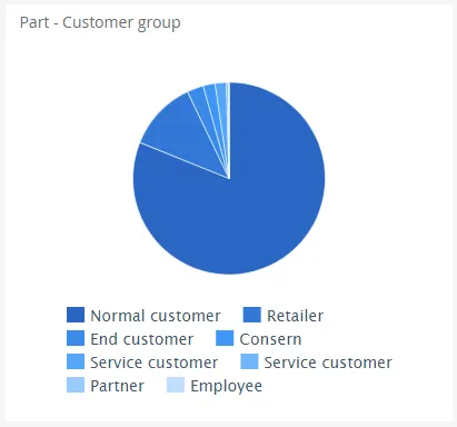
The image shows a pie chart displaying revenue distribution by customer group, with each slice representing the proportion of total revenue for that group.
Quickstart
Section titled “Quickstart”To create a Pie chart, initialize the graph, add an axis, and use addGraphData with chart_type: "pie".
$olap.addGraph('3','Part - Customer group','[Company]:[customer_group]',"")$olap.addGraphAxis("3","1","Amount","")$olap.addGraphData('3','1','1','[customer_group]:[customer]','sum([invoiced_amount_dcur])','pie',"","","")$olap.setGraphSize("3","XS12","SM3","MD3","LG3")This produces a pie chart where each slice represents a customer group’s share of total revenue, with drill-down capability to customer level.
Series setup
Section titled “Series setup”Pie charts don’t use traditional X/Y axes. Instead, the series column determines the slices.
Required setup:
$olap.addGraphAxis('graph_id', 'axis_id', 'Label', '')$olap.addGraphData('graph_id', 'axis_id', 'label', 'series', 'measure', 'pie', '', '', '')Key points:
- The
seriescolumn creates the slices (one slice per unique value) - The
measuredetermines slice size (proportional to total) - Use colon-separated series for drill-down:
"[level1]:[level2]"
Example with drill-down:
$olap.addGraphData('3','1','Revenue','[customer_group]:[customer]','sum([amount])','pie',"","","")This creates a pie where clicking a customer group slice drills down to show customers within that group.
Data series
Section titled “Data series”Add data using addGraphData with chart_type: "pie". The series column determines slices.
Syntax:
$olap.addGraphData( "graph_id", "axis_id", "dataseries_label", "series", "measure", "pie", "", "filter", "limit", "orderby")Parameters:
| Parameter | Required | Description | Example |
|---|---|---|---|
graph_id | Yes | Unique graph identifier | "3" |
axis_id | Yes | The axis ID | "1" |
dataseries_label | Yes | Label (usually "1" or "-") | "1" |
series | Yes | Column(s) for slices. Use : for drill-down | "[category]" or "[group]:[item]" |
measure | Yes | Value to calculate (determines slice size) | "sum([amount])" |
chart_type | Yes | Must be "pie" | "pie" |
aggregation | No | Not used for pie (use "") | "" |
filter | No | Additional filter | "[status] = 1" |
limit | No | Limit number of slices shown | "10" |
orderby | No | Sort slices. "M" for largest first | "M" |
Example - Simple pie:
$olap.addGraphData('3','1','1','[customer_group]','sum([invoiced_amount_dcur])','pie',"","","")Example - With drill-down:
$olap.addGraphData('3','1','Revenue','[customer_group]:[customer]','sum([amount])','pie',"","","")Example - Top 5 only:
$olap.addGraphData('3','1','1','[product]','sum([sales])','pie',"","","5","M")Size and layout
Section titled “Size and layout”Pie charts work well at smaller sizes. Use setGraphSize for responsive layout.
$olap.setGraphSize("graph_id", "XS12", "SM3", "MD3", "LG3")Recommended sizes:
- Small:
"XS12", "SM3", "MD3", "LG3"(quarter width) - Medium:
"XS12", "SM4", "MD4", "LG4"(third width) - Large:
"XS12", "SM6", "MD6", "LG6"(half width)
Common patterns
Section titled “Common patterns”Simple distribution
Section titled “Simple distribution”Show percentage breakdown of a single dimension:
$olap.addGraph("1", "Sales by Region", "[region]", "","0");$olap.addGraphAxis("1","1","Amount","")$olap.addGraphData("1","1","1","[region]","sum([sales])","pie","","","")Drill-down pie
Section titled “Drill-down pie”Enable clicking to drill into details:
$olap.addGraph("1", "Revenue Breakdown", "[division]:[product_group]", "","0");$olap.addGraphData("1","1","Revenue","[division]:[product_group]","sum([revenue])","pie","","","")Top N slices
Section titled “Top N slices”Show only largest categories:
$olap.addGraphData("1","1","1","[product]","sum([sales])","pie","","","5","M")Percent of total labels
Section titled “Percent of total labels”Calculate percentages in measure (if needed for display):
$olap.addGraphData("1","1","%","[category]","sum([amount]) / sum(sum([amount])) * 100","pie","","","")Multiple pie charts
Section titled “Multiple pie charts”Create separate graphs for different breakdowns:
// Pie 1: By region$olap.addGraph("1", "By Region", "[region]", "","0");$olap.addGraphData("1","1","1","[region]","sum([sales])","pie","","","")
// Pie 2: By product$olap.addGraph("2", "By Product", "[product]", "","0");$olap.addGraphData("2","1","1","[product]","sum([sales])","pie","","","")
Troubleshooting
Section titled “Troubleshooting”Pie not showing
Section titled “Pie not showing”- Check: Ensure
chart_typeis exactly"pie"(lowercase) - Check: Verify series column has valid values (not all NULL)
- Check: Confirm measure returns numeric values
Slices too small to see
Section titled “Slices too small to see”- Issue: Many small slices make chart unreadable
- Fix: Use
limitto show only top N slices:$olap.addGraphData("1","1","1","[category]","sum([amount])","pie","","","10","M")
Wrong proportions
Section titled “Wrong proportions”- Issue: Slices don’t match expected percentages
- Check: Verify measure calculation (sum vs count vs avg)
- Check: Ensure filter doesn’t exclude part of data
- Check: NULL values in measure may be excluded
Drill-down not working
Section titled “Drill-down not working”- Issue: Clicking slice doesn’t show details
- Check: Series must use colon format:
"[level1]:[level2]" - Check: Both levels must exist in split element:
"[level1]:[level2]"inaddGraph - Check: Ensure data exists for drill-down level
Too many slices
Section titled “Too many slices”- Issue: Chart cluttered with many small slices
- Fix: Use
limitparameter to restrict number - Fix: Group categories before charting (create calculated column)
- Fix: Filter to relevant subset
Q: Can I show percentages on slices?
A: The chart automatically calculates proportions. For explicit percentage labels, you may need to calculate in the measure, but typically the visual size is sufficient.
Q: What’s the difference between pie and donut charts?
A: In this system, both use chart_type: "pie". The visual difference (if any) is handled by styling.
Q: Can I have multiple pie charts in one graph?
A: No, each graph shows one pie. Create separate graphs if you need multiple pies.
Q: How do I sort slices?
A: Use orderby: "M" to sort by measure (largest first). Without it, slices appear in data order.
Q: Can I filter which slices appear?
A: Yes, use the filter parameter in addGraphData or filter in the addGraph method.
Q: What if I have NULL values in series?
A: NULL values may create an “Unknown” slice or be excluded. Filter them out if not desired:
$olap.addGraph("1", "Title", "[category]", "[category] IS NOT NULL","0")Q: How do I show “Other” for small slices?
A: Group small categories in a calculated column before charting, or use limit and accept that small slices won’t appear.
Q: Can I customize slice colors?
A: Yes, use setGraphColors to define a custom color palette for the pie slices.
Related
Section titled “Related”- Graph Method Overview - Complete reference for all graph methods
- TreeMap - Alternative area-based proportional visualization
- Column - Stacked columns as alternative to pie
- Bar - Horizontal bars for comparing categories