Gauge
Overview
Section titled “Overview”- Type: One-dimensional circular gauge/speedometer chart
- Dimensions: Single value displayed on a semi-circular gauge
- Use cases: Display KPIs, show performance against targets, visualize completion percentages, monitor metrics
- Special features: Color-coded ranges (plot bands) for visual performance indication, supports target values
- Visual: Semi-circular gauge with needle pointing to current value, color zones indicate performance levels
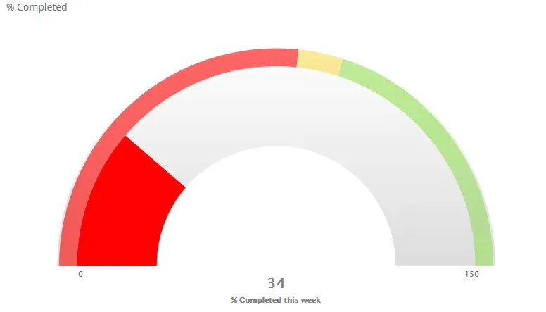
The image shows a gauge chart displaying ”% Completed this week” with color-coded zones: red for low (0-53.3%), yellow for medium (53.3-60%), and green for high (60-120%) performance levels.
Quickstart
Section titled “Quickstart”To create a Gauge chart, initialize the graph, add an axis with fixed range, add plot bands for color zones, and use addGraphDataWithTarget.
$olap.addGraph("4", "% Completed", "[company_name]", "[week]=$period.getCP()","0")$olap.addGraphAxis('4', '1', '% Completed this week','false','0','150','150')$olap.addGraphPlotBands('4', '1', '50','#ff0000','0','.533');$olap.addGraphPlotBands('4', '1', '150','#F9DD51','.5333','.6');$olap.addGraphPlotBands('4', '1', '2000','#98DF58','.6','1.2');$olap.addGraphDataWithTarget("4", "1","1", "[company_name]", "round(sum(case when [postatus_no] in (300) then [hours_to_plan] else 0.0001 end)/(sum([used_capacity_hrs]+[capasity_hrs])),2)*100", "(100)", "gauge","", "", "","")This produces a gauge chart showing completion percentage with color-coded performance zones and a target indicator.
Axes setup
Section titled “Axes setup”Gauge charts require one axis with a fixed range. The axis defines the gauge scale.
Required axis setup:
$olap.addGraphAxis('graph_id', 'axis_id', 'Label','false','min','max','interval')Key points:
- Always set
min,max, andinterval(don’t use NULL) - The range should cover your expected values plus some buffer
intervalshould divide evenly into the range for clean tick marks
Example:
$olap.addGraphAxis('4', '1', '% Completed this week','false','0','150','150')Common ranges:
- Percentage:
'0','100','10'(0-100% in 10% steps) - Ratio:
'0','1','0.1'(0-1.0 in 0.1 steps) - Score:
'0','10','1'(0-10 in 1-point steps)
Data series
Section titled “Data series”Use addGraphDataWithTarget (not addGraphData) for gauge charts. This method includes a target value.
Syntax:
$olap.addGraphDataWithTarget( "graph_id", "axis_id", "dataId", "serie", "measure", "target", "gauge", "stacked", "filter", "limit", "orderBy")Parameters:
| Parameter | Required | Description | Example |
|---|---|---|---|
graph_id | Yes | Unique graph identifier | "4" |
axis_id | Yes | The axis ID | "1" |
dataId | Yes | Label (usually "1") | "1" |
serie | Yes | Column for multiple gauges | "[company_name]" |
measure | Yes | KPI calculation | "sum([completed])/sum([total])*100" |
target | Yes | Target value in parentheses | "(100)" or "(80)" |
chart_type | Yes | Must be "gauge" | "gauge" |
stacked | No | Not used (use "") | "" |
filter | No | Additional filter | "[status] = 1" |
limit | No | Limit number of gauges | "10" |
orderBy | No | Sort method | "M" |
Example:
$olap.addGraphDataWithTarget("4", "1","1", "[company_name]", "round(sum([completed_hours])/sum([total_hours]),2)*100", "(100)", "gauge","", "", "","")Plot bands for color zones:
$olap.addGraphPlotBands('graph_id', 'axis_id', 'Title','Color','FromValue','ToValue')Example - Three zones:
$olap.addGraphPlotBands('4', '1', 'Low','#ff0000','0','.533'); // Red: 0-53.3%$olap.addGraphPlotBands('4', '1', 'Medium','#F9DD51','.5333','.6'); // Yellow: 53.3-60%$olap.addGraphPlotBands('4', '1', 'High','#98DF58','.6','1.2'); // Green: 60-120%Size and layout
Section titled “Size and layout”Control responsive width using setGraphSize. Gauges work well at smaller to medium sizes.
$olap.setGraphSize("graph_id", "XS12", "SM3", "MD3", "LG3")Recommended sizes:
- Small:
"XS12", "SM3", "MD3", "LG3"(quarter width) - for dashboards - Medium:
"XS12", "SM4", "MD4", "LG4"(third width) - Large:
"XS12", "SM6", "MD6", "LG6"(half width) - for detailed view
Common patterns
Section titled “Common patterns”Single KPI gauge
Section titled “Single KPI gauge”Display one key metric:
$olap.addGraph("1", "Sales Target", "[region]", "","0");$olap.addGraphAxis('1', '1', '% of Target','false','0','150','25')$olap.addGraphPlotBands('1', '1', 'Below','#ff0000','0','.8');$olap.addGraphPlotBands('1', '1', 'On Target','#98DF58','.8','1.2');$olap.addGraphDataWithTarget("1", "1","1", "[region]", "sum([sales]) / sum([target]) * 100", "(100)", "gauge","", "", "","")Multiple gauges (one per category)
Section titled “Multiple gauges (one per category)”Show gauge for each item in series:
$olap.addGraph("1", "Performance by Team", "[team_name]", "","0");$olap.addGraphAxis('1', '1', 'Score','false','0','10','1')$olap.addGraphDataWithTarget("1", "1","1", "[team_name]", "avg([performance_score])", "(8)", "gauge","", "", "","")Completion percentage
Section titled “Completion percentage”Track progress toward goal:
$olap.addGraphDataWithTarget("1", "1","1", "[project]", "sum([completed_tasks]) / sum([total_tasks]) * 100", "(100)", "gauge","", "", "","")Performance zones
Section titled “Performance zones”Three-zone performance indicator:
$olap.addGraphPlotBands('1', '1', 'Poor','#ff0000','0','.6'); // 0-60%$olap.addGraphPlotBands('1', '1', 'Good','#F9DD51','.6','.9'); // 60-90%$olap.addGraphPlotBands('1', '1', 'Excellent','#98DF58','.9','1.2'); // 90-120%Troubleshooting
Section titled “Troubleshooting”Gauge not showing
Section titled “Gauge not showing”- Check: You must use
addGraphDataWithTarget, notaddGraphData - Check: Ensure
chart_typeis exactly"gauge"(lowercase) - Check: Verify axis has valid min/max/interval (not NULL)
Needle outside range
Section titled “Needle outside range”- Issue: Value exceeds axis max, needle doesn’t show
- Fix: Increase
maxvalue inaddGraphAxisto accommodate all possible values - Fix: Add buffer (e.g., if max value is 100, set max to 120)
Plot bands not visible
Section titled “Plot bands not visible”- Issue: Color zones don’t appear
- Check: Plot band values must be within axis range (0 to 1.0 relative to max)
- Check: Ensure
FromValue<ToValue - Fix: Calculate relative values: if axis is 0-100 and you want 0-50, use
'0','0.5'
Target not showing
Section titled “Target not showing”- Issue: Target indicator missing
- Check: Target must be in parentheses:
"(100)"not"100" - Check: Target value should be within axis range
Wrong color zones
Section titled “Wrong color zones”- Issue: Colors don’t match expected ranges
- Fix: Plot band values are relative (0-1.0). For 0-100 axis:
- 0-50% =
'0','0.5' - 50-80% =
'0.5','0.8' - 80-100% =
'0.8','1.0'
- 0-50% =
Q: Can I use regular addGraphData for gauges?
A: No, you must use addGraphDataWithTarget which includes the target parameter required for gauge charts.
Q: How do I calculate plot band values?
A: Plot bands use relative values (0-1.0). Divide your absolute value by axis max: if axis is 0-100 and you want 50, use 0.5.
Q: Can I have multiple gauges in one graph?
A: Yes, use a series column in addGraphDataWithTarget. Each unique value creates a separate gauge.
Q: How do I set the target value?
A: Use parentheses in the target parameter: "(100)" for 100, "(80)" for 80. The parentheses are required.
Q: What’s the difference between gauge and pie charts?
A: Gauges show a single value on a semi-circle with target/performance zones. Pies show proportional parts of a whole.
Q: Can I customize gauge colors?
A: Yes, use addGraphPlotBands to define color zones. You can have multiple bands with different colors.
Q: How do I show percentages?
A: Calculate percentage in your measure: "sum([value])/sum([total])*100" and set axis max to 100 or higher.
Q: Why is my gauge showing wrong value?
A: Check your measure calculation. Ensure it returns a number within the axis range. Verify filters aren’t excluding data.
Related
Section titled “Related”- Graph Method Overview - Complete reference for all graph methods
- addGraphDataWithTarget - Method documentation
- addGraphPlotBands - Color zone setup
- Pie - Alternative circular visualization
- KPIs - KPI documentation (if available)