Combined
Overview
Section titled “Overview”- Type: Multi-series chart combining different chart types
- Dimensions: X-axis (categories), Y-axis (values), optional second Y-axis
- Use cases: Compare measures with different scales, show trends with bars, display related metrics together
- Special features: Supports dual Y-axes (left and right), can mix column, line, spline, and other types
- Visual: Multiple series with different visualizations overlaid on the same graph
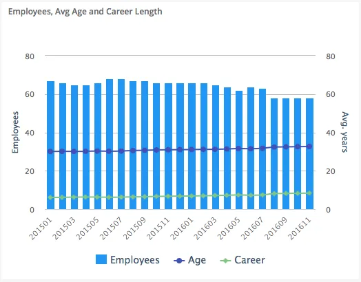
The image shows a combined chart with columns (employees count) on the left Y-axis and spline lines (average age and career length) on the right Y-axis, all sharing the same X-axis (companies).
Quickstart
Section titled “Quickstart”To create a Combined chart, initialize the graph, add multiple axes (one per scale), and add data series with different chart types.
$olap.addGraph("1", "Employees, Avg Age and Career Length", "[time_month]:[key_company]", "","0");$olap.addGraphAxis('1', '1', 'Employees','false')$olap.addGraphAxis('1', '2', 'Avg. years','true','0','80','10')$olap.addGraphData("1", "1","Employees", "[key_company]", "count(distinct [employee_number])", "column","", "", "");$olap.addGraphData("1", "2","Age", "[key_company]", "avg([age])", "spline","", "", "")$olap.addGraphData("1", "2","Career", "[key_company]", "avg([career_length])", "spline","", "", "");This produces a combined chart with columns showing employee count on the left axis, and spline lines showing average age and career length on the right axis.
Axes setup
Section titled “Axes setup”Combined charts require multiple Y-axes when measures have different scales. Use opposite: true for the second axis.
Required setup for dual axes:
$olap.addGraphAxis('graph_id', 'axis_id_1', 'Left Axis Label','false')$olap.addGraphAxis('graph_id', 'axis_id_2', 'Right Axis Label','true','min','max','interval')Key points:
- First axis (
opposite: false) = left side - Second axis (
opposite: true) = right side - Always set min/max/interval on second axis to prevent scale changes when filtering
- First axis can auto-scale, but second should be fixed
Example:
$olap.addGraphAxis('1', '1', 'Employees','false')$olap.addGraphAxis('1', '2', 'Avg. years','true','0','80','10')Single axis (same scale):
$olap.addGraphAxis('1', '1', 'Amount','false')// All series use axis_id '1'Data series
Section titled “Data series”Add multiple data series with different chart_type values. Each series references its axis ID.
Syntax for each series:
$olap.addGraphData( "graph_id", "axis_id", // Which axis this series uses "dataseries_label", "series", "measure", "chart_type", // Different types: "column", "spline", "line", etc. "", "filter", "limit", "orderby")Parameters:
| Parameter | Required | Description | Example |
|---|---|---|---|
graph_id | Yes | Unique graph identifier | "1" |
axis_id | Yes | Which axis this series uses | "1" or "2" |
dataseries_label | Yes | Label in legend | "Employees" |
series | Yes | Column for grouping | "[key_company]" |
measure | Yes | Value to display | "count(distinct [id])" |
chart_type | Yes | Type: "column", "spline", "line", "bar", etc. | "column" |
aggregation | No | "stacked" for columns, "" for lines | "stacked" or "" |
filter | No | Additional filter | "[status] = 1" |
limit | No | Limit series items | "10" |
orderby | No | Sort method | "M" |
Example - Column + Spline:
$olap.addGraphData("1", "1","Employees", "[key_company]", "count(distinct [employee_number])", "column","", "", "");$olap.addGraphData("1", "2","Age", "[key_company]", "avg([age])", "spline","", "", "")$olap.addGraphData("1", "2","Career", "[key_company]", "avg([career_length])", "spline","", "", "");Example - Multiple columns on same axis:
$olap.addGraphData("1", "1","Revenue", "[month]", "sum([revenue])", "column","stacked", "", "");$olap.addGraphData("1", "1","Cost", "[month]", "sum([cost])", "column","stacked", "", "");Size and layout
Section titled “Size and layout”Control responsive width using setGraphSize. Combined charts benefit from adequate space.
$olap.setGraphSize("graph_id", "XS12", "SM6", "MD6", "LG6")Recommended sizes:
- Medium:
"XS12", "SM6", "MD6", "LG6"(half width) - Large:
"XS12", "SM8", "MD8", "LG8"(two-thirds width) - Full:
"XS12", "SM12", "MD12", "LG12"(full width)
Common patterns
Section titled “Common patterns”Column + Line (dual axis)
Section titled “Column + Line (dual axis)”Show counts as columns, percentages as line:
$olap.addGraph("1", "Sales Analysis", "[month]", "","0");$olap.addGraphAxis('1', '1', 'Count','false')$olap.addGraphAxis('1', '2', 'Percentage','true','0','100','10')$olap.addGraphData("1", "1","Sales Count", "[month]", "count(*)", "column","", "", "");$olap.addGraphData("1", "2","% of Total", "[month]", "count(*) / sum(count(*)) * 100", "spline","", "", "");Multiple lines on secondary axis
Section titled “Multiple lines on secondary axis”Compare related metrics:
$olap.addGraphAxis('1', '1', 'Revenue','false')$olap.addGraphAxis('1', '2', 'Ratios','true','0','100','10')$olap.addGraphData("1", "1","Revenue", "[month]", "sum([revenue])", "column","", "", "");$olap.addGraphData("1", "2","Margin %", "[month]", "sum([profit])/sum([revenue])*100", "spline","", "", "");$olap.addGraphData("1", "2","Growth %", "[month]", "((sum([revenue]) - lag(sum([revenue]))) / lag(sum([revenue]))) * 100", "spline","", "", "");Stacked columns + trend line
Section titled “Stacked columns + trend line”Show composition and trend:
$olap.addGraphData("1", "1","Product A", "[month]", "sum([sales_a])", "column","stacked", "", "");$olap.addGraphData("1", "1","Product B", "[month]", "sum([sales_b])", "column","stacked", "", "");$olap.addGraphData("1", "2","Total Trend", "[month]", "sum([sales_a]) + sum([sales_b])", "spline","", "", "");Bar + Line combination
Section titled “Bar + Line combination”Mix horizontal bars with lines:
$olap.addGraphData("1", "1","Volume", "[category]", "sum([volume])", "bar","", "", "");$olap.addGraphData("1", "2","Efficiency", "[category]", "avg([efficiency])", "spline","", "", "");Troubleshooting
Section titled “Troubleshooting”Second axis scale changes
Section titled “Second axis scale changes”- Issue: Right axis scale changes when filtering, breaking comparisons
- Fix: Always set explicit
min,max,intervalon second axis:$olap.addGraphAxis('1', '2', 'Label','true','0','100','10')
Series not visible
Section titled “Series not visible”- Check: Verify each series uses correct
axis_idmatching an axis - Check: Ensure
chart_typeis valid ("column","spline","line", etc.) - Check: Verify measures return numeric values
Overlapping series
Section titled “Overlapping series”- Issue: Multiple series obscure each other
- Fix: Use different chart types (columns + lines instead of all columns)
- Fix: Adjust series order (lines typically render on top)
- Fix: Use transparency or different colors with
setGraphColors
Wrong axis assignment
Section titled “Wrong axis assignment”- Issue: Series appears on wrong axis
- Fix: Check
axis_idinaddGraphDatamatchesaxis_idinaddGraphAxis - Fix: First axis should have
opposite: false, secondopposite: true
Legend confusion
Section titled “Legend confusion”- Issue: Hard to tell which series uses which axis
- Fix: Use descriptive labels that indicate the measure type
- Fix: Consider color coding (e.g., blue for left axis, red for right axis)
Q: Can I combine more than 2 chart types?
A: Yes, but it can become cluttered. Limit to 2-3 series for readability. Use different chart types (column + line) rather than all the same type.
Q: Do I need dual axes?
A: Only if measures have very different scales. If all measures are in similar ranges, use a single axis.
Q: Can I stack columns and show a line?
A: Yes, use aggregation: "stacked" for column series, and chart_type: "spline" or "line" for the trend.
Q: How do I ensure the second axis doesn’t auto-scale?
A: Always provide min, max, and interval parameters in the second addGraphAxis call with opposite: true.
Q: Can I have multiple lines on the same axis?
A: Yes, add multiple addGraphData calls with the same axis_id and chart_type: "spline" or "line".
Q: What chart types can I combine?
A: Common combinations: column + spline, column + line, bar + line. Most types can be combined, but test for readability.
Q: How do I color code by axis?
A: Use setGraphColors to assign colors. Typically, use one color family for left axis series, another for right axis.
Q: Can I combine pie with other types?
A: No, pie charts cannot be combined with other types in the same graph. Create separate graphs instead.
Related
Section titled “Related”- Graph Method Overview - Complete reference for all graph methods
- Column - Column chart basics
- Spline - Line/spline chart basics
- Bar - Bar chart basics
- addGraphAxis - Dual axis setup