Column
Overview
Section titled “Overview”- Type: Two-dimensional chart with vertical columns
- Dimensions: X-axis (categories), Y-axis (values)
- Use cases: Compare values across categories, show trends over time, display grouped or stacked data
- Special features: Supports stacking (putting different groups together) and aggregation (aggregates from previous split element)
- Visual: Vertical columns proportional to values, making it easy to compare magnitudes
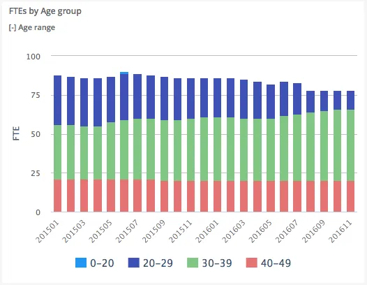
The image shows a column chart displaying FTEs (Full-Time Equivalents) by age groups over time, with each month showing stacked columns representing different age ranges.
Quickstart
Section titled “Quickstart”To create a Column chart, initialize the graph, add an axis, and add data with chart_type: "column".
$olap.addGraph("2", "FTEs by Age group", "[time_month]:[age_range]", "","0");$olap.addGraphAxis('2', '1', 'FTE','false')$olap.addGraphData("2", "1","-", "[age_range]", "Sum([fraction]/100)", "column","stacked", "", "");This produces a column chart where data is grouped by age ranges and stacked, with the split on months showing development over time.
Axes setup
Section titled “Axes setup”Column charts require at least one Y-axis. The X-axis is defined by the split_element in addGraph.
Required axis setup:
$olap.addGraphAxis('graph_id', 'axis_id', 'Axis Label', 'false')Parameters:
graph_id: Your graph identifieraxis_id: Unique identifier for this axis (used when adding data)Axis Label: Text displayed on the axisfalse: Left side (default). Usetruefor right side (dual axis)
Example with dual Y-axis:
$olap.addGraphAxis('1', '1', 'Count','false')$olap.addGraphAxis('1', '2', 'Percentage','true','0','100','10')Data series
Section titled “Data series”Add data using addGraphData with chart_type: "column". The series column creates multiple visual groups (stacked or grouped).
Basic data setup:
$olap.addGraphData( "graph_id", "axis_id", "dataseries_label", "series", "measure", "column", "aggregation", "filter", "limit", "orderby")Parameters:
| Parameter | Required | Description | Example |
|---|---|---|---|
graph_id | Yes | Unique identifier of the graph | "2" |
axis_id | Yes | The axis identifier | "1" |
dataseries_label | Yes | Label in legend/tooltip. Use "-" to inherit from series | "-" or "Revenue: -" |
series | Yes | Column for grouping/stacking. Different values = different colors | "[age_range]" or "[product_group]" |
measure | Yes | Expression to calculate | "Sum([amount])" or "count(distinct [id])" |
chart_type | Yes | Must be "column" | "column" |
aggregation | No | "stacked" or "aggregated". NULL for grouped | "stacked" |
filter | No | Additional filter for this series | "[status] = 1" |
limit | No | Limit number of series shown | "10" |
orderby | No | Sort method. "M" for measure descending | "M" |
Example - Stacked columns:
$olap.addGraphData("2", "1","-", "[age_range]", "Sum([fraction]/100)", "column","stacked", "", "");Example - Grouped columns (no stacking):
$olap.addGraphData("2", "1","Revenue", "[product_group]", "sum([amount])", "column","", "", "");Size and layout
Section titled “Size and layout”Control responsive width using setGraphSize with Bootstrap grid classes.
$olap.setGraphSize("graph_id", "XS12", "SM6", "MD6", "LG6")Parameters:
XS12: Full width on mobile (12/12 columns)SM6: Half width on tablets (6/12 columns)MD6: Half width on desktops (6/12 columns)LG6: Half width on large screens (6/12 columns)
Common sizes:
- Full width:
"XS12", "SM12", "MD12", "LG12" - Half width:
"XS12", "SM6", "MD6", "LG6" - Third width:
"XS12", "SM4", "MD4", "LG4"
Common patterns
Section titled “Common patterns”Stacked columns by category
Section titled “Stacked columns by category”Group data by one dimension and stack by another:
$olap.addGraph("1", "Sales by Region", "[month]:[region]", "","0");$olap.addGraphAxis('1', '1', 'Amount','false')$olap.addGraphData("1", "1","-", "[region]", "sum([sales])", "column","stacked", "", "");Top N items
Section titled “Top N items”Show only the top items by measure:
$olap.addGraphData("1", "1","-", "[product_name]", "sum([revenue])", "column","", "", "10", "M");Percent of total
Section titled “Percent of total”Calculate percentage values:
$olap.addGraphData("1", "1","% of Total", "[category]", "sum([amount]) / sum(sum([amount])) * 100", "column","", "", "");Dual Y-axis
Section titled “Dual Y-axis”Compare measures with different scales:
$olap.addGraphAxis('1', '1', 'Count','false')$olap.addGraphAxis('1', '2', 'Percentage','true','0','100','10')$olap.addGraphData("1", "1","Count", "[category]", "count(*)", "column","", "", "");$olap.addGraphData("1", "2","%", "[category]", "count(*) / sum(count(*)) * 100", "column","", "", "");Time series with grouping
Section titled “Time series with grouping”Show trends over time with grouped categories:
$olap.addGraph("1", "Sales Trend", "[invoice_month]:[product_group]", "","0");$olap.addGraphData("1", "1","-", "[product_group]", "sum([amount])", "column","", "", "");Troubleshooting
Section titled “Troubleshooting”Columns not showing
Section titled “Columns not showing”- Check: Ensure
chart_typeis exactly"column"(lowercase) - Check: Verify
split_elementinaddGraphcontains valid column references - Check: Confirm measure expression returns numeric values
Stacking not working
Section titled “Stacking not working”- Issue: Columns appear grouped instead of stacked
- Fix: Set
aggregation: "stacked"inaddGraphData - Note: Empty string
""means grouped, not stacked
Wrong axis scale
Section titled “Wrong axis scale”- Issue: Y-axis scale changes when filtering
- Fix: Set explicit
min,max, andintervalinaddGraphAxis:$olap.addGraphAxis('1', '1', 'Label','false','0','1000','100')
Missing data points
Section titled “Missing data points”- Check: Verify filter expressions don’t exclude all data
- Check: Ensure
split_elementvalues exist in your dataset - Check: NULL values in split element may be hidden
Q: Can I mix stacked and grouped columns in the same chart?
A: No, each data series uses one aggregation mode. Create separate charts if you need both.
Q: How do I sort columns by value?
A: Use orderby: "M" in addGraphData to sort by measure descending. For ascending, you may need to filter/limit differently.
Q: Can I use column charts for time series?
A: Yes, use a time column (e.g., [invoice_month]) as the split element. Columns will display chronologically.
Q: What’s the difference between stacked and aggregated?
A: Stacked shows segments on top of each other. Aggregated groups them side-by-side. Use stacked to show composition, aggregated to compare groups.
Q: How do I show percentages instead of absolute values?
A: Calculate percentage in your measure: "sum([amount]) / sum(sum([amount])) * 100" or use a calculated column.
Q: Can I have multiple Y-axes?
A: Yes, add multiple axes with different IDs and reference them in different addGraphData calls. Set opposite: true for right-side axis.
Q: Why are some columns missing?
A: Check filters, NULL values in split element, or if limit is excluding data. Verify data exists for those categories.
Related
Section titled “Related”- Graph Method Overview - Complete reference for all graph methods
- Bar - Horizontal bar charts (alternative to column)
- Combined - Mix column with other chart types
- Spline - Line charts for trends
- TreeMap - Area-based visualization