Bubble
Overview
Section titled “Overview”- Type: Three-dimensional chart with X, Y, and Z (bubble size) dimensions
- Dimensions: X-axis (first measure), Y-axis (second measure), Z-axis (bubble size/third measure)
- Use cases: Analyze relationships between three variables, compare entities across multiple dimensions, identify outliers
- Special rules: The “opposite” axis in
addGraphAxisbecomes the X-axis. UseaddGraphBubbleDatainstead ofaddGraphData - Visual: Bubbles positioned by X/Y coordinates, with size representing the third dimension
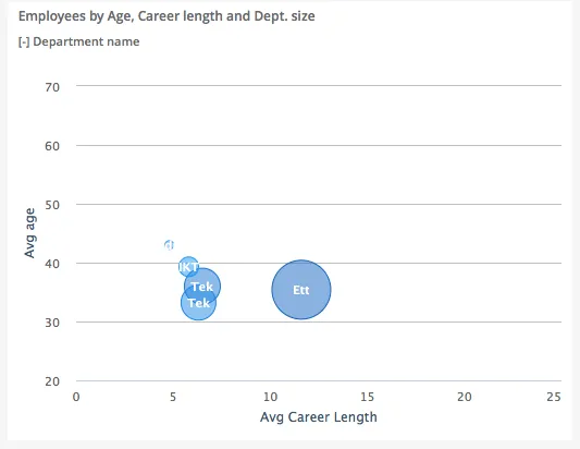
The image shows a bubble chart displaying employees by age (Y-axis), career length (X-axis), and department size (bubble size), with each department represented as a colored bubble.
Quickstart
Section titled “Quickstart”To create a Bubble chart, initialize the graph, set up axes (opposite axis = X-axis), and use addGraphBubbleData with three measures.
$olap.addGraph("5", "Employees by Age, Career length and Dept. size", "[key_company]:[department_name]", "","0");$olap.addGraphAxis('5', '1', 'Avg age','false','20','70','10')$olap.addGraphAxis('5', '1', 'Avg Career Length','true','0','25','5')$olap.addGraphBubbleData("5", "1","-", "[department_name]", "round(avg([career_length]),1)", "round(avg([age]),1)", "count(distinct [employee_number])", "", "","")This produces a bubble chart where each department is a bubble positioned by average career length (X) and age (Y), with size representing number of employees.
Axes setup
Section titled “Axes setup”Bubble charts require special axis setup: the opposite axis becomes the X-axis.
Required setup:
$olap.addGraphAxis('graph_id', 'axis_id', 'Y-axis Label','false','min','max','interval')$olap.addGraphAxis('graph_id', 'axis_id', 'X-axis Label','true','min','max','interval')Important rules:
- First axis (
opposite: false) = Y-axis (vertical) - Second axis (
opposite: true) = X-axis (horizontal) - Always set
min,max, andintervalto prevent scale changes when filtering
Example:
$olap.addGraphAxis('5', '1', 'Avg age','false','20','70','10')$olap.addGraphAxis('5', '1', 'Avg Career Length','true','0','25','5')Data series
Section titled “Data series”Use addGraphBubbleData (not addGraphData) with three measures: X, Y, and bubble size.
Syntax:
$olap.addGraphBubbleData( "GraphId", "AxisId", "DataId", "Serie", "Measure", "Measure2", "Measure3", "Filter", "Limit", "OrderBy")Parameters:
| Parameter | Required | Description | Example |
|---|---|---|---|
GraphId | Yes | Unique graph identifier | "5" |
AxisId | Yes | The axis ID (use same as axes) | "1" |
DataId | Yes | Label. Use "-" to inherit from serie | "-" or "Dept: -" |
Serie | Yes | Column for coloring bubbles | "[department_name]" |
Measure | Yes | X-axis value (first measure) | "round(avg([career_length]),1)" |
Measure2 | Yes | Y-axis value (second measure) | "round(avg([age]),1)" |
Measure3 | Yes | Bubble size (third measure) | "count(distinct [employee_number])" |
Filter | No | Additional filter expression | "[status] = 1" |
Limit | No | Limit number of bubbles (applies to first measure) | "10" |
OrderBy | No | Sort by first measure. "M" for descending | "M" |
Example:
$olap.addGraphBubbleData("5", "1","-", "[department_name]", "round(avg([career_length]),1)", // X-axis "round(avg([age]),1)", // Y-axis "count(distinct [employee_number])", // Bubble size "", "", "")Size and layout
Section titled “Size and layout”Control responsive width using setGraphSize. Bubble charts work well at medium to large sizes.
$olap.setGraphSize("graph_id", "XS12", "SM6", "MD6", "LG6")Recommended sizes:
- Medium:
"XS12", "SM6", "MD6", "LG6"(half width) - Large:
"XS12", "SM8", "MD8", "LG8"(two-thirds width) - Full:
"XS12", "SM12", "MD12", "LG12"(full width)
Common patterns
Section titled “Common patterns”Correlation analysis
Section titled “Correlation analysis”Show relationship between two metrics with size as third dimension:
$olap.addGraph("1", "Sales vs Profit", "[region]", "","0");$olap.addGraphAxis('1', '1', 'Sales','false','0','1000000','100000')$olap.addGraphAxis('1', '1', 'Profit %','true','0','50','5')$olap.addGraphBubbleData("1", "1","-", "[region]", "sum([profit]) / sum([sales]) * 100", // X: Profit % "sum([sales])", // Y: Sales "count(distinct [customer_id])", // Size: Customer count "", "", "")Top N bubbles
Section titled “Top N bubbles”Show only largest bubbles:
$olap.addGraphBubbleData("1", "1","-", "[product]", "sum([revenue])", "sum([profit])", "sum([quantity])", "", "10", "M");Performance matrix
Section titled “Performance matrix”Compare efficiency (X) vs volume (Y) with size as impact:
$olap.addGraphBubbleData("1", "1","-", "[department]", "avg([efficiency_score])", // X: Efficiency "sum([hours])", // Y: Total hours "sum([cost])", // Size: Cost impact "", "", "")Time-based bubbles
Section titled “Time-based bubbles”Use time in split element to show evolution:
$olap.addGraph("1", "Performance Over Time", "[month]:[team]", "","0");$olap.addGraphBubbleData("1", "1","-", "[team]", "avg([quality_score])", "avg([speed_score])", "count([tasks])", "", "", "");Troubleshooting
Section titled “Troubleshooting”Bubbles not showing
Section titled “Bubbles not showing”- Check: You must use
addGraphBubbleData, notaddGraphData - Check: All three measures (X, Y, size) must return numeric values
- Check: Verify axis setup with
opposite: truefor X-axis
Wrong axis mapping
Section titled “Wrong axis mapping”- Issue: Bubbles appear in wrong position
- Fix: Remember: first measure = X-axis, second = Y-axis, third = size
- Fix: X-axis requires
opposite: truein secondaddGraphAxiscall
Bubbles too small or too large
Section titled “Bubbles too small or too large”- Issue: Size differences not visible
- Fix: Normalize the third measure or use logarithmic scale if appropriate
- Fix: Adjust axis min/max to focus on relevant range
Overlapping bubbles
Section titled “Overlapping bubbles”- Issue: Bubbles obscure each other
- Fix: Use
limitto show fewer bubbles - Fix: Increase chart size with
setGraphSize - Fix: Add filter to focus on specific subset
Axis scale changes when filtering
Section titled “Axis scale changes when filtering”- Issue: Chart becomes unreadable after filtering
- Fix: Always set explicit
min,max,intervalin both axes:$olap.addGraphAxis('1', '1', 'Y Label','false','0','100','10')$olap.addGraphAxis('1', '1', 'X Label','true','0','50','5')
Q: Can I use regular addGraphData for bubble charts?
A: No, you must use addGraphBubbleData which accepts three measures (X, Y, size).
Q: Which axis is X and which is Y?
A: The axis with opposite: true is X-axis (horizontal). The axis with opposite: false is Y-axis (vertical).
Q: How do I control bubble colors?
A: Colors come from the Serie column. Different values in that column get different colors.
Q: Can I have multiple bubble series?
A: Yes, call addGraphBubbleData multiple times with different series or filters to overlay multiple bubble groups.
Q: What if my measures have very different scales?
A: Normalize your measures or use calculated percentages. You can also set different axis ranges, but ensure they make sense for comparison.
Q: How do I show labels on bubbles?
A: Use setShowGraphDataLabels with the graph and axis ID. Labels may overlap if bubbles are close.
Q: Can I limit which bubbles are shown?
A: Yes, use the limit parameter in addGraphBubbleData. It applies to the first measure (X-axis).
Q: Why are some bubbles missing?
A: Check filters, NULL values in measures, or if bubbles are outside the visible axis range. Verify all three measures return valid numbers.
Related
Section titled “Related”- Graph Method Overview - Complete reference for all graph methods
- addGraphBubbleData - Method documentation
- Column - Two-dimensional column charts
- Combined - Mix chart types including bubbles
- Scatter plots - Alternative for X/Y relationships