Bar
Overview
Section titled “Overview”- Type: Two-dimensional chart with horizontal bars
- Dimensions: Y-axis (categories), X-axis (values)
- Use cases: Rank items, show top N performers, compare categories when names are long, display best/worst lists
- Special features: Horizontal orientation makes long category names more readable than vertical columns
- Visual: Horizontal bars proportional to values, making ranking and comparison easy
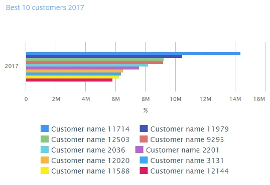
The image shows a horizontal bar chart displaying the top 10 customers by revenue percentage, with bars extending horizontally to show relative values.
Quickstart
Section titled “Quickstart”To create a Bar chart, initialize the graph, add an axis, and use addGraphData with chart_type: "bar".
$olap.addGraph("5","Best 10 customers ?period.getYear()","[invoice_year]","[invoice_year]=?period.getYear()","0");$olap.addGraphAxis("5","1","%","");$olap.addGraphData("5","1","","[customer_name]","sum([invoiced_amount_dcur])","bar","","","10","M");$olap.setGraphSize('5','XS12','SM4','MD4','LG4')This produces a horizontal bar chart showing the top 10 customers ranked by revenue, sorted descending (M = measure descending).
Axes setup
Section titled “Axes setup”Bar charts require one Y-axis (horizontal axis in bar charts). The X-axis (values) is automatic.
Required axis setup:
$olap.addGraphAxis('graph_id', 'axis_id', 'Axis Label', 'false')Parameters:
graph_id: Your graph identifieraxis_id: Unique identifier for this axisAxis Label: Text displayed on the axis (typically the measure unit)false: Standard position (left side for values)
Example:
$olap.addGraphAxis("5","1","%","")Data series
Section titled “Data series”Add data using addGraphData with chart_type: "bar". The series column creates the bars (one per category).
Syntax:
$olap.addGraphData( "graph_id", "axis_id", "dataseries_label", "series", "measure", "bar", "", "filter", "limit", "orderby")Parameters:
| Parameter | Required | Description | Example |
|---|---|---|---|
graph_id | Yes | Unique graph identifier | "5" |
axis_id | Yes | The axis ID | "1" |
dataseries_label | Yes | Label (use "" or "-" for simple bars) | "" |
series | Yes | Column for categories (creates bars) | "[customer_name]" |
measure | Yes | Value to display | "sum([amount])" |
chart_type | Yes | Must be "bar" | "bar" |
aggregation | No | Not typically used (use "") | "" |
filter | No | Additional filter | "[status] = 1" |
limit | No | Limit number of bars (top N) | "10" |
orderby | No | Sort method. "M" for measure descending | "M" |
Example - Top 10:
$olap.addGraphData("5","1","","[customer_name]","sum([invoiced_amount_dcur])","bar","","","10","M");Example - All items sorted:
$olap.addGraphData("5","1","Revenue","[product]","sum([sales])","bar","","","","M");Example - With filter:
$olap.addGraphData("5","1","","[region]","sum([amount])","bar","","[year] = 2024","","M");Size and layout
Section titled “Size and layout”Control responsive width using setGraphSize. Bar charts work well at medium sizes.
$olap.setGraphSize("graph_id", "XS12", "SM4", "MD4", "LG4")Common sizes:
- Medium:
"XS12", "SM4", "MD4", "LG4"(third width) - Half:
"XS12", "SM6", "MD6", "LG6"(half width) - Full:
"XS12", "SM12", "MD12", "LG12"(full width)
Common patterns
Section titled “Common patterns”Top N ranking
Section titled “Top N ranking”Show only the best performers:
$olap.addGraph("1", "Top 10 Products", "[year]", "[year] = 2024","0");$olap.addGraphAxis("1","1","Sales","");$olap.addGraphData("1","1","","[product_name]","sum([sales])","bar","","","10","M");Best vs worst
Section titled “Best vs worst”Create two graphs or use filters:
// Best$olap.addGraphData("1","1","Best","[item]","sum([value])","bar","","","10","M");
// Worst (ascending would need different approach)
Percentage comparison
Section titled “Percentage comparison”Show values as percentages:
$olap.addGraphData("1","1","%","[category]","sum([amount]) / sum(sum([amount])) * 100","bar","","","","M");Time-based ranking
Section titled “Time-based ranking”Rank items within each time period:
$olap.addGraph("1", "Monthly Top 5", "[month]:[product]", "","0");$olap.addGraphData("1","1","","[product]","sum([sales])","bar","","","5","M");Long category names
Section titled “Long category names”Bar charts excel when category names are long:
$olap.addGraphData("1","1","","[full_product_description]","sum([revenue])","bar","","","","M");Troubleshooting
Section titled “Troubleshooting”Bars not showing
Section titled “Bars not showing”- Check: Ensure
chart_typeis exactly"bar"(lowercase) - Check: Verify series column has valid values
- Check: Confirm measure returns numeric values
Wrong sorting
Section titled “Wrong sorting”- Issue: Bars not in expected order
- Fix: Use
orderby: "M"for descending by measure - Fix: Remove
orderbyfor data order, or use"A"for ascending (if supported)
Too many bars
Section titled “Too many bars”- Issue: Chart cluttered with many bars
- Fix: Use
limitparameter to show top N only:$olap.addGraphData("1","1","","[category]","sum([amount])","bar","","","10","M")
Long category names cut off
Section titled “Long category names cut off”- Issue: Category labels truncated
- Fix: Increase chart width with
setGraphSize(use SM6/MD6 or larger) - Fix: Consider abbreviating category names in data
Bars too small to compare
Section titled “Bars too small to compare”- Issue: Values too close to distinguish
- Fix: Check if measure scale is appropriate (may need normalization)
- Fix: Use different measure or filter to relevant range
Q: What’s the difference between bar and column charts?
A: Bar charts are horizontal (good for long names), column charts are vertical (good for time series). Use bar for ranking, column for trends.
Q: Can I stack bars like columns?
A: Bar charts typically don’t use stacking. Use column charts if you need stacked visualization.
Q: How do I show bottom N instead of top N?
A: Use ascending sort if supported, or calculate inverse measure. Typically bar charts show top performers.
Q: Can I have multiple bar series?
A: Bar charts work best with single series. For multiple measures, consider column charts or combined charts.
Q: How do I format the axis labels?
A: Axis label comes from addGraphAxis. For value formatting, ensure your measure returns appropriately formatted numbers.
Q: Can I use bar charts for time series?
A: Not recommended. Use column or spline charts for time-based data. Bar charts are for ranking/categorization.
Q: What if I have negative values?
A: Negative values will extend bars in the opposite direction, which may be confusing. Filter or transform negative values if not desired.
Q: How do I limit to top 10?
A: Use limit: "10" and orderby: "M" in addGraphData:
$olap.addGraphData("1","1","","[item]","sum([value])","bar","","","10","M")Related
Section titled “Related”- Graph Method Overview - Complete reference for all graph methods
- Column - Vertical column charts (alternative to bar)
- Combined - Mix bar with other chart types
- Spline - Line charts for trends